Thorsten Hasenkamm

My first though on Thorsten’s work was: “What nice character designs.” But, as I got further and further down his tumblr , I began seeing more and more work that made this artist really stand out from the plethora of other great illustrators.

Can you find just one influence in the work below? The seamless merging of old masters Paul Cezanne, Henri Matisse, and Wassily Kandinsky with ‘contemporary’ masters such as Mary Blaire and Lou Romano. This isn’t someone who just wanted to work at Pixar and started tracing animation stills from The Incredibles, but instead someone who wanted to be a great artist. His sense of design is of course in top shape, but its not just a style: he pushes the way he sees a shape, the form and function of it, and pushes that idea to become something greater than the subject he originally intended to represent.

tumblr_naqckupfIh1sm0gg2o1_1280 tumblr_nenfxyg1761sm0gg2o1_500 tumblr_njolvj8Js61sm0gg2o1_1280 tumblr_njy3im9Igo1sm0gg2o1_1280 tumblr_nkt6fqOoMw1sm0gg2o1_1280 tumblr_nlonvcR0CO1sm0gg2o1_500 tumblr_nmx2h9CTGQ1sm0gg2o1_1280 tumblr_nnni2u49nh1sm0gg2o1_1280

http://thorstenhasenkamm.tumblr.com/

Before They Pass Away – Jimmy Nelson

Before reading any of my thoughts, my opinions or seeing any of these images, go on this journey for yourself. Look through the website, get lost in it and develop your own relationship to these works. http://www.beforethey.com/ This is an … Continue reading

Valerio Fabbretti

Story time, children.

I met Valerio for the first time years ago when I was still modeling for the AAU. It was always a bit embarrassing to see students in the halls afterwards, as for many it may have been their first nude female experience, and there was always a certain look in a (most often male) student’s eyes when they were thinking of you, now fully clothed and off the clock, naked. Anyways, Valerio was in his first year and in a beginner’s foundation course for figure drawing and it was the first day of class. I remember him being very hungry for learning and a general wide-eyed approach to the whole experience, and the way he handled himself was so passionate that I knew he’d do something great. You can kind of tell, sometimes, when someone has what it takes, especially when you see thousands of students a week while modeling. You can see who listens, who challenges, and who keeps the spark in their eye going. Valerio was right at home at the AAU, and though I never really talked to him again (we spoke briefly that first day, when he complimented my modeling), I always saw him around and noticed how he was still excited to be there, years later.

Now I think he has graduated and has some very interesting projects underway. I noticed his name pop up on a “Must see illustrators from CTN” and I had a tiny ping of pride at seeing this student come all that way from his first day at AAU to being a full, accomplished artist. And, a really, really spectacular one at that.

I won’t go so into the why of how these drawings are so amazing. I think its because I can’t really put my finger on it .- I mean, he isn’t reinventing the wheel with these works, necessarily. Some artists we feature are so unique and special and that is why they are special. Of course these are incredibly strong drawings, with solid weight and character to both the pose and layout. They are definitely superb in their execution, and they are a great blend of traditional and digital tools. But I think for me what is the most captivating is how much he likes drawing these. That same passion I saw in him that first day in school is still felt in these drawings and it brings a very special relationship to the work. No one wants to see a piece of work that someone hated making – especially a children’s book drawing. It was Mr. Rogers who said “Kids can spot a phony a mile away”, so I think it is especially important to have a love of the craft in that field of illustration.

Cheers Valerio, I hope to see that passion last for years to come.

02 (1) 02 03 06 (1) 06 08 (1) 08 10

http://www.valeriofabbretti.com/moby.html

Neil Ross – Interview

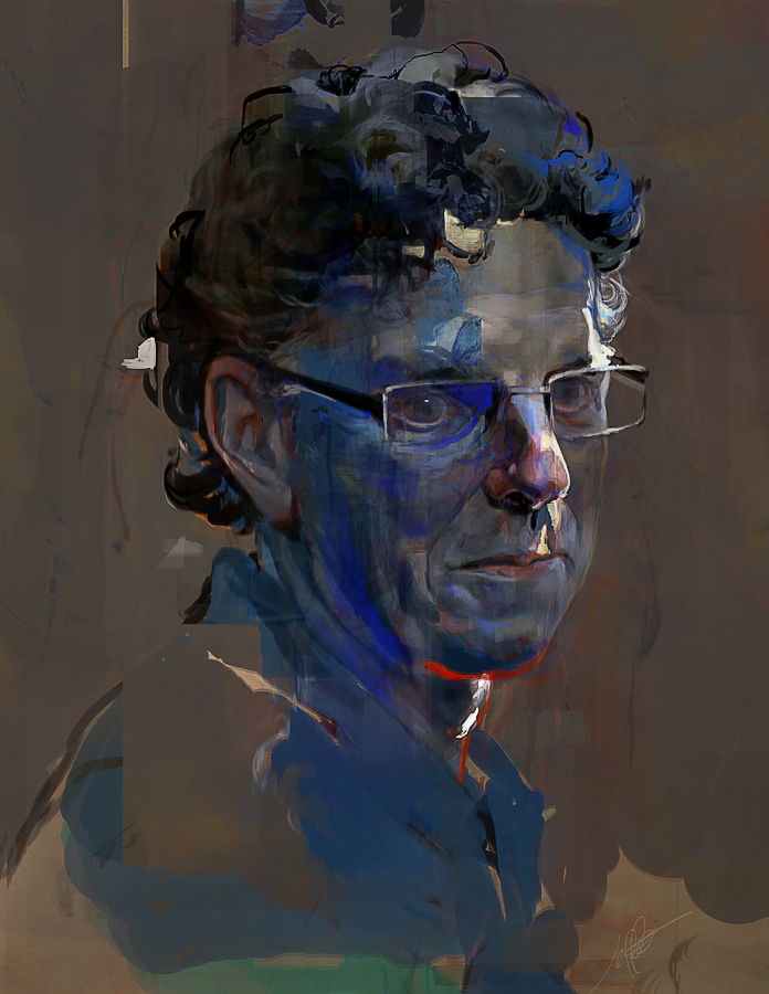
In special one-two-punch, (and as an appeal for clemency for not having posted since August!), we bring you Neil Ross, both in splendid visual format as well as an exclusive interview for your perusal.
(I thought we posted his work previously, seeing as how long I have been using his work as my desktop background I assumed I had talked about him by now, but apparently not!)

I found him through his personal work, but most people may recognize his work from the new Tron: Uprising series, as well as such hits as Hotel Transyvlania, Prince of Persia, Corpse Bride, and more. His work combines hyper abstract shapes with representationalism that I haven’t seen anywhere else – where your mind is given just enough information to imagine what it is meant to see, but when under closer observation there are simply thousands of linear designs that move your eye in an overwhelming pattern. It is beautiful, and I am happy to be able to talk more with him about his process and past.

WAr Room-SC.237b Skyline7b 3Town7Fj(B)small

———-

1) Would you mind explaining your history, both any possible education and inspiration? Your work is wonderfully unique and it’d be great to learn how you came upon such a cool style.

I grew up on the Northumberland coast. It was a landscape of chimney stacks, ruined castles, pit heads, islands with abandoned hermitages, mudflats with derelict ironworks. The first art I liked were illustrations of birds, beasts, prehistoric reptiles and a comic called Creepy Magazine.

At the age of about ten I found a pocket-sized book on the Surrealists that cast a spell on me. Here were the things seen with the inner eye. I did not know you were allowed to do this. This was my introduction, although unaware of it at the time, to Dali’s ‘paranoid-critical’ position. In fact, I can see now that I have a persistent fascination with grand paranoiac theories, narratives and people.

I did Graphic Design at art school and then spent a year or three doing badly paid illustrations for advertising agencies in Manchester. After a spell at Cosgrove Hall Films I moved to London and got a job at Richard Williams Animation on Soho Square. This was where drawing, painting and film-making came together for me.

Dick Williams was brilliant, eccentric and ran things like an artist’s studio – not like a business whose economic base was making TV commercials. This waywardness was part of Dick’s appeal and I found him to be a very stimulating and charismatic figure although my admiration may not have been apparent to him at the time.

To begin with I was an odd-job man assisting animators and doing background artwork in different styles and different media. It would depend on what the advertising agencies were asking for. I had no ‘style’ of my own. After a while Dick began to give me whole commercials to design. I would work out how things were to look and what media we’d use, then I would team up with an animator and we’d wade through the thing together until it was done. In those days Soho ran on beer, tobacco and hash. We sucked these tarry fuels into ourselves and stayed up all hours drawing and squinting through the gas. It was a good time.

Dick had unusual reasons for firing people. You could be ousted for “… only coming in to use the toilet.” I was booted out for “… bringing my illegitimate children into the studio.” (Actually, I have one child and she isn’t illegitimate, although I did bring her in a couple of times.) I don’t hold it against him. He was a demanding boss, I respect his paranoia and, anyway, I was re-hired when things cooled down and he saw that I was not the cause of whatever had got the shit to hit the fan.

Eventually I did leave of my own accord. It was unwise move. I entered into a dark period. I made background paintings for animated commercials from pastels and hairspray. There was a demand for such things. But it was a demand that I was increasingly unwilling to fulfil so I enrolled at the University of London and studied History with the hope of finding some relief from my misery in the workings of the past.

Out of the blue I got an offer to work on a feature film about Jewish mice in the Wild West. I accepted without hesitation and climbed aboard a long, steep learning curve with plenty of opportunity to see things from the paranoid-critical position.

bloks4

2) Your work is generally non-figurative, or at least the focal point is of a layout. Many of our students talk about how all they want to draw are humans and never practice backgrounds or layouts, even for works in comics or illustrations where jobs aren’t divided into so many titles such as background and character design. Do you have any advice for how to get interested in this field and where you find your motivation?

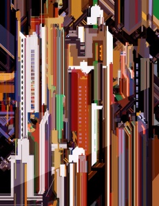
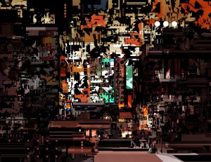
I see why you say that. It’s true that the imagery I’ve been concerned with in my personal work in recent times is – I’d first say – ‘topographical’ but then ‘topomaniacal’ or ‘topogigamist’ might be more appropriate. I’m motivated by the city I see around me. When I came to London it seemed to be a place that was solidly unchangeable but now things change every day – demolition and construction goes on all the time. The old East End is now a theme park of   architectural fashions and urban recovery schemes. My pictures depict built space. It may all be what Rem Koolhaas has called ‘Junkspace’ but I’m happy to find myself in it. Sometimes the pictures are based on a particular place, sometimes not. I improvise and always hope to find more than I have originally imagined. After an hour or two of working on a picture it will take on a life of it’s own and I will try to follow that animus. I am under no obligation to do other than accurately represent the images as they occur. Occasionally I put distinct figures into the images but now I feel inclined to avoid that because they imply narratives that lead me astray. This is not an uninhabited place. There is inner life here, making its way through the rat runs. There is also the client and cult of congestion represented by the Domestic, Art & Utility corporation.

Architects, planners, politicians, ideologues attempt to plan the city but it seems to have its own theorem. The city itself may be the dominant life form of the future. We may inhabit it like tiny mammals in the Jurassic. A calamity may have occurred. What remains is unredeemed. The city seems to re-build itself on top of itself. Some structures are familiar: offices, apartments, balconies, stations. Others are hard to identify. What activities do they contain?

This is an on-going project that I’m working on with the writer, Mark Holloway. Eventually it will be a book.

On students…

Students who are primarily interested in drawing humans are onto the right thing. Once they’ve got their life drawing skills down they can move onto something else….. If they want to. If you only wish to draw the human form then animation seems the job for you. If you want to do comics then you probably need a sense of place or a collaborator who has one, but come to think of it, I can’t imagine an artist who isn’t interested in the way the world looks.

balcony 12

3) What is the goal of each of your pieces? Do you aim for a focal point, a general atmosphere or a contrast of colors, for example? Does this differ for your personal work?

I’ve covered some of this above but, speaking practically, I’m looking for an abstract composition. I often begin with a very simple thumbnail in black and white and one gray tone ONLY. The action and play of light is intrinsic to making a composition. You can learn a lot about composition by looking at pre-war black and white movies. Once the German craftsmen made their way into Hollywood in the late 20’s bringing the ideas of Expressionist Cinema things began to take form. Contemporary camera work is not so instructive because they move around too much. I’m not saying there isn’t great composition in today’s cinematography but it pays to go back to the source.

Colours? Well, I like yellow and red and blue.

parts 12small2

4) It is easy for the eye to get mesmerized by your shapes and how abstract the designs can be. At the same time, a lot of your textures take on a water color look. Both of these are fairly traditional techniques – so how do you combat the idea that digital painting isn’t a ‘real’ form of art?

I sometimes use patches of watercolour or acrylic that I paint and scan to make into ‘brushes’. Working in Photoshop lies somewhere between painting and photography. When I was an art student I spent hours fooling around in the darkroom with exposures and developing times (this was all pre-digital of course). One of the drawbacks with pixel-based artwork is the closer you get in to it, the less it’s interesting. This is not true of artwork made from ‘traditional’ materials, neither is it true of non-digital photography. Go close in on a painting by Vermeer or a photograph by Lartigue and new worlds begin to emerge before your eyes. So I experiment with grain and grunge to break up the surface and allow suggestions to occur.

Most digital art is produced on the way toward something else. I mean that it is a designer’s tool. The end result will be not the digital painting but something else. The digital paint stage is just part of the process. The medium was not meant to make art in some grand sense. But even so, you can use it to make art, why not? Art is not a fine thing, it’s just another thing. However, there are long standing hierarchies in the art game. Oil paint is higher than water colour, portraiture is higher than still life and so on. In this sense, digital painting is considered to be very low ‘genre’. The folks out there are a little suspicious of digital paint. They’re not sure we’re putting the hours in. Perhaps we just type in stuff and go off to the pub.

When it comes to my personal work I have certain rules. I don’t photo-bash and I don’t use software that imitates painterly brush strokes. I’m not a purist and these techniques are quite OK for working on movies and games – whatever works, works. But they won’t get me the graphic clarity that I like. I’m looking for images that are worth more than a glance so, increasingly, I’m aiming to make a very complex image.

Altarpiece_2

5) 5 Greatest Inspirations and Motivators (as we are an artist’s inspiration blog)

Moebius (How can you avoid him.)

Lebbeus Woods (His writings and ideas as well as the exquisite drawings.)

Milton Glaser (The first graphic designer to hold my attention. I’m still delighted by his work.)

Felix Vallotton.

Jacques Majorelle.

I have to cheat and add a joker to my hand: Dali – more for his ideas than his paintings.

——

Check out more of his work at the links below.

http://limbolo.blogspot.no/

http://www.limbolo.net/

Jeff Simpson

Jeff Simpson is an illustrator currently working for Eidos Montreal. He has worked quite a few times with Imagine FX magazine, doing covers, lectures, and tutorials. His work is really phenomenal in how it blends the illustrative and Fine Art world – his style is sometimes reminiscent of Phil Hale and Rick Berry, with their intense brushwork and color usage. There is a stylistic line between his personal work and freelance work, but both are equally skilled.  I really commend people who are able to still be so prolific in-between working hours, personal life and other events and still find time to draw for themselves. But, you don’t get this good by sitting back and waiting for inspiration to strike. 

I personally like his abstract portraits the best. Of course his concept work and character designs are rad, but nothing tickles my fancy more than an artist using digital skills in traditional mediums – his oil paintings (though they are ‘spruced up’, it seems, in Photoshop) have the same thought process and technique as his digital paintings do, and vice versa. His digital work has an authenticity that can only stem from his traditional work. His work never underestimates the ability of the user’s eye – his work is perfectly balanced in detail, knowing full well that the human eye can only see so much at once. His pieces aren’t over worked, but instead focus nicely on compositional elements that really bring beauty to the audience’s eyes without getting tired. It bothers me sometimes when artists treat the entirety of their pieces with the same amount of rendering and detail. Simpson never makes that mistake.

tumblr_lt6lvn4MDw1r4lbmro1_1280 tumblr_mt2eqexV3z1r4lbmro1_1280 tumblr_myczr5Raz31r4lbmro1_1280 tumblr_n6ksh2yxdv1r4lbmro1_1280 tumblr_n6twklZNnp1r4lbmro1_1280 tumblr_n8iyjstwAg1r4lbmro1_1280 tumblr_n8sbuwZoe21r4lbmro1_1280 tumblr_n451hay0hb1r4lbmro1_1280

http://jeffsimpsonkh.tumblr.com/

Anton Kusters – Inside the Yakuza

This information is taken from the artist’s website itself, as there is no way I could say it better.

In the hotel bar in Niigata, I’m only slowly starting to understand the extremely subtle social interaction that is continuously happening, the micro-expressions on the faces, the gestures, the voices and intonations, the body language.

As the bar is evacuated to make room for the godfather having a coffee, everything seems to be strictly organized but at the same time seems to come naturally: strangely, I don’t need anyone to tell me what to do, where to sit, when to talk or when to shut up.

It’s like I literally feel the boundaries, the implicit expectations, and I am slowly learning when I can move forward, and when to best hold back. Sitting at the table with a bodyguard looking straight through me, I drink from my iced coffee. I’m feeling the acute sensation of walking on eggshells.


——–


YAKUZA is a personal visual account of the life inside an inaccessible subculture: a traditional Japanese crime family that controls the streets of Kabukicho, in the heart of Tokyo, Japan.

Through 10 months of negotiations with the Shinseikai, my brother Malik and I became one of the only westerners ever to be granted this kind of access to the closed world of Japanese organized crime.

With a mix of photography, film, writing and graphic design, I try to share not only their complex relationship to Japanese society, but also to show the personal struggle of being forced to live in two different worlds at the same time; worlds that often have conflicting morals and values. It turns out not to be a simple ‘black’ versus ‘white’ relationship, but most definitely one with many, many, many shades of grey.


mantattooed800x500 nittosan800x500 suits800x500 tattooback800x500 waitingforgodfather800x500

http://antonkusters.com/

Sterling Hundley to host 2-day workshop with Blank Space

2

In the beginning of October 2014 Sterling Hundley, creator of Blue Collar / White Collar,has agreed to host a special, one-time creative workshop for the Norwegian public, in collaboration with his new exhibition opening with Blank Space on October 3rd 2014. 

The workshop will focus on ideation and problem solving from direct observation. Students will utilize a sketchbook to complete assignments that requires the individual to seek a site specific experience, and will culminate in a critique. Mr. Hundley will lead the adventure himself while delivering lectures and leading discussions. This workshop is designed for passionate and enthusiastic students of all ages and levels.

Space is limited. For more details, contact Liz Ramsey at blankspaceoslo@gmail.com

6

About the exhibition:

The Spoils is a body of work that analyzes the validity of legend from the point of view of the vanquished, not the history drafted by the victor. The Spoils of Saint Hubris is a reinterpretation of the story of Saint Hubert, the patron saint of the animals and hunters. Legend tells that while hunting on Easter Sunday, Saint Hubert came upon God in the clearing, in the form of the white stag of Arthurian legend. Falling to his knees and vowing to give up his worldly goods, Hubert was blessed by God and later anointed the Patron Saint of animals and hunters by the Catholic Church.

 The Spoils of Saint Hubris tells another truth. Hubris chooses to take God as the ultimate trophy. The paintings included are from a larger body of work that speaks of apathy, loyalty and the consequences of man’s unending ambition and need to control that which should not be culled. Through the combination of traditional oil painting techniques and the geometry of digital art and screen printing, this The Spoils of Saint Hubris speaks to the clashing of science and nature; the precise and the organic.

 Sterling Hundley is an icon and a recognized advocate in his field. Co-founding The Art Department, a pinnacle of higher education for the visual arts, as well as being a key faculty member at Virginia Commonwealth University, the largest public art school in the USA, in combination with his extensive history of publications, collectors, awards and medals he is truly a treat to bring to the Norwegian public. He is also the focal point of the highly sought after  Blue Collar / White Collar, a 160 page introspective into his mind and process.

logo2_small


Killian Eng

I’m not sure you could find a better Jean Giraud (aka: Moebius, aka: awesome) tribute still working today. Or ever. These pieces are mind blowing, and not just in the sheer detail involved in each piece (I recommend visiting his blog simply to see the close-up shots of these pieces. They are tiny, finished compositions each and ever one), but the scale, dedication, and awareness each piece has. There is a cohesion between the massive amounts of details, lines, colors, shapes, and ideas. It all clicks together in one big sci-fi world filled with robots, owls, and warriors. The way he handles the rendering of objects is so inspired by Moebius that at some times its hard to tell its NOT one of his pieces. The wavy lines, the staccato marks and nouveau designs all swirl together to make a modern day master piece that I believe Giraud would be proud of, if not amazed by. While Eng currently seems to be content to work commercially, doing DVD menus, album covers and silk screen prints (yes, I know, some of these ARE silk screen prints – try not to let your head explode), I’ll be (im)patiently awaiting the day he decides to shift into narrative story telling with comics and animation.

tumblr_mxthcyICzo1qbluruo1_r1_1280

tumblr_mxx8zofDyJ1qbluruo1_1280

tumblr_myy1tcfSqS1qbluruo1_1280

tumblr_n5kkl27TLo1qbluruo2_r1_1280

tumblr_n5q5nroqFZ1qbluruo6_1280

tumblr_n7ozkmwsS51qbluruo1_1280

tumblr_n9acsdAPzs1qbluruo1_1280

tumblr_n9c3rc55Bp1qbluruo2_r1_1280

tumblr_n59vp9Y0zJ1qbluruo1_1280
http://dwdesign.tumblr.com/

Edward Wesson


Not too much information on Wesson I can find online, and the stub of a wiki article isn’t even helping:

Edward Wesson (April 29, 1910[1] – 1983) was an English watercolour artist.

His work is known for its simplicity, boldness and mastery of brushwork. He is remembered by many painters as a very encouraging teacher.

He had one daughter, Elizabeth Wesson

.”

Thank GOD, I really was wondering if he had offspring and what his student’s thought of him – THAT is good news. His work is, however, simplistic, bold, and masterful so at least they got that part right.

But seriously, these paintings are very charming. They are simple in their shape design and usage of colors. You won’t see layers upon layers here, but clear cut silhouettes matched with strong pen work on top. He is a typical watercolorist, finding the minimum amount of information to describe his topic so as to never overwork. My favorite part is his simple outlines sometimes used in pen, it really gives them an illustrative feel, especially the renderings on shadows. I think it takes them from normal watercolors to impressive pieces. One of the best pieces I found on him was a study of a house (shown below) done in multiple weather conditions -notice the temperature differences on the white house (hint: it looks cooler in warm weather, interestingly enough).

137 23833e381fc57b3bf7da6d2296d6808d 122784-Charing,_Kent 122784-Great_Wishford,_near_Salisbury 122784-Windsor_Castle edward_wesson_ri_rba_rsma_the_national_gallery_and_st_martins_d5341804g edward-wesson-shalfleet4 IMG_1965_4_2_2_2 lot1733-0 LS149709_HR Weston_Green_winter-spring_Hornblower_watercolour

Interview – Dan Hillier

Featured a few days back, we are lucky enough to have Dan Hillier answer a few questions about his work, inspiration, and process.
 
—–
 
DH
 
Anyone with even the littlest internet connection can see you sell your work at The Sunday UpMarket in London. As someone who tires from the tyranny of gallery-only artists, and the disconnect this creates for most audiences, I am really happy to see you reach out in this ‘abnormal’ fashion. Do you man the stall yourself? Are they priced within reach for average stroller-bys? What provoked you to move forward in this direction instead of selling your work entirely through higher end galleries?
I’m not there most of the time these days, especially when it’s sunny and there are parks and ponds to be lurked in, but I have manned it for the last few weeks.  I try and get down there now and again to keep an eye on how it is and also it’s good to meet the folks who are buying my work.  In the first instance it was just about getting my work out there in a way I thought would work for me.  In the beginning I was printing stuff at home on a small scale and wasn’t ready for galleries and so on, and it’s kind of stuck with me.  I like being in control of what I do and it’s nice not to hand over 50% to a gallery.  That said, I do also enjoy working with galleries as all of the admin stuff is taken out of the equation and it’s a decent way to reach new people. It’s good to mix it up I think.  The prints at the market go from £40 to £350 so there’s something for everyone.
 
You work with digital engravings, which is already a fascinating subject. I know you work with collage and ink, when necessary, but I am interested to hear more of your process from your point of view – the subjects are so ethereal, where do they come from? (Dreams?) Do you have a large storage of pre-sorted images that you draw from, or just play around as you go?
I do have a large amount of prints and pages from old Illustrated London News, source books and various bits and pieces from all over the place that I draw from.  I generally start with an idea of what I want to make, which can be set off by another piece of work of my own or someone else’s, a sudden thought, music or anything, and then start to put the basics together, and by the process of seeking out other elements to put the thing together I tend to get led along by what I find and the original idea changes shape as I go.  I scan bits of old prints into photoshop and then play around with them and draw into them using a digital pen, or sometimes scans of pen and ink drawings.  When I draw, such as with At the Edge of the Woods, I use a dip nib pen and ink.  I’m planning a lot more drawing in the next year.
 
At The Edge of The Woods

At The Edge of the Woods

 
 Between The Louvre, Glastonbury, Saatchi and more, you’ve quite a CV. What do you personally feel is your favorite accomplishment? Any real turning points or epiphanies in your artistic career?
Probably having my work in the Louvre, because it’s the bloody Louvre!  Also because the final product – a 2 metre wide praxinoscope – was such a beautiful object, and quite silly.  They originally wanted me to make some work showing the life of a trunk packer but I said it would be more fun to make some weird shit popping out of boxes and they went for it.
 
Steampunk, Vintage, Gothic, Bestial – everyone is trying so hard to categorize your work. Where do you place your art, or do you attempt to not be defined? 
I’m not that interested in definitions, though Steampunk is one I hear a lot and I’m not that keen on as it doesn’t quite fit in my mind.
 
5 Favorite artists, inspirations or other favorite motivational factors in your work.
Music is a big inspiration for me – Swans, Loscil, Philip Glass, Radiohead and Liars at the moment especially.  Max Ernst was obviously a big influence on me visually and I went to see the Matisse show lately a the Tate which blew me away and completely sealed my long held plan to make colour work from here on in. Buddhist and Christian iconography has always fascinated and inspired me and I’m moving closer and closer to making something resembling these I think.  Psychedelics and meditation have been an influence on me too, and recently I’ve been getting stuck into a lot of Terence McKenna recordings – he was a megadude and he makes for an inspiring call to arms when it comes to creativity and questioning what we think we know.  I’m off to the Peruvian Amazon in a month which I expect will have quite an effect on where I go next, if I ever come back.
 
hillier_pre


Stefan Glerum

The first thing that strikes me about Stefan Glerum’s work is how unique it is. There have been a few artists featured here who have styles that somehow just work, and that you haven’t really seen before. Of course there are elements that are similar or inspired from similar sources, but I can’t lay my finger on just one influence. That’s one thing that really peaks my interest here.

Stefan Glerum was trained by Joost Swarte, a famous Dutch cartoonist and graphic designer, which is where we begin to piece the puzzle pieces of Gerlum’s style from. His work is heavily influenced by old Belgian comics, with an added Art Deco, Bauhus, and Pop Surrealist feel (add in some Constructionist for taste), as well as a strong eye for design and composition. He incorporates text into his work like a pro – the lettering fits like a glove with his rigid and constructed lines. 

I’m particularly fond of this work with the Bavarian State Opera. The rigid constructional line work is a really base for the composition and does a fantastic job of relaying both the concept and feel of the show – it feels almost like puppets performing a grand performance. Because it draws such a deep, blurry line between realistic and stylized depictions of scenes and people the audience is readily swooped into the image, ready to place their own thoughts and opinions into the piece. 

bike_wanda_glerum_2048 BSO_2013_14_Premierenplakate_Glerum_Soldaten_Tell_Orfeo.indd new_republic_glerum_2048 occupational_hazards_1_glerum occupational_hazards_3_glerum BSO_2013_14_Premierenplakate_Glerum_FrauohneSchatten_Forza_final Premierenplakate_Tito_web vpro_european_glerum


http://www.stefanglerum.com/